

AeroDuct is a real ducting company that designs and manufactures air-conditioning duct systems (round, rectangular, spiral and oval) for residential, commercial and industrial properties. The company approached me to build its brand: it wanted to come across as young, innovative and trusted.
03 · Develop
Logo Exploration
I started with initial ideation on logos to understand what the client is looking for and what their direction is.
After understanding their direction and vision for the company, I set some fonts and made a few logos considering where and how they will be used
I set a visual understanding of how the end product may look, making only minor changes between the options so that the client wouldn’t be confused visually.
04 · Deliver
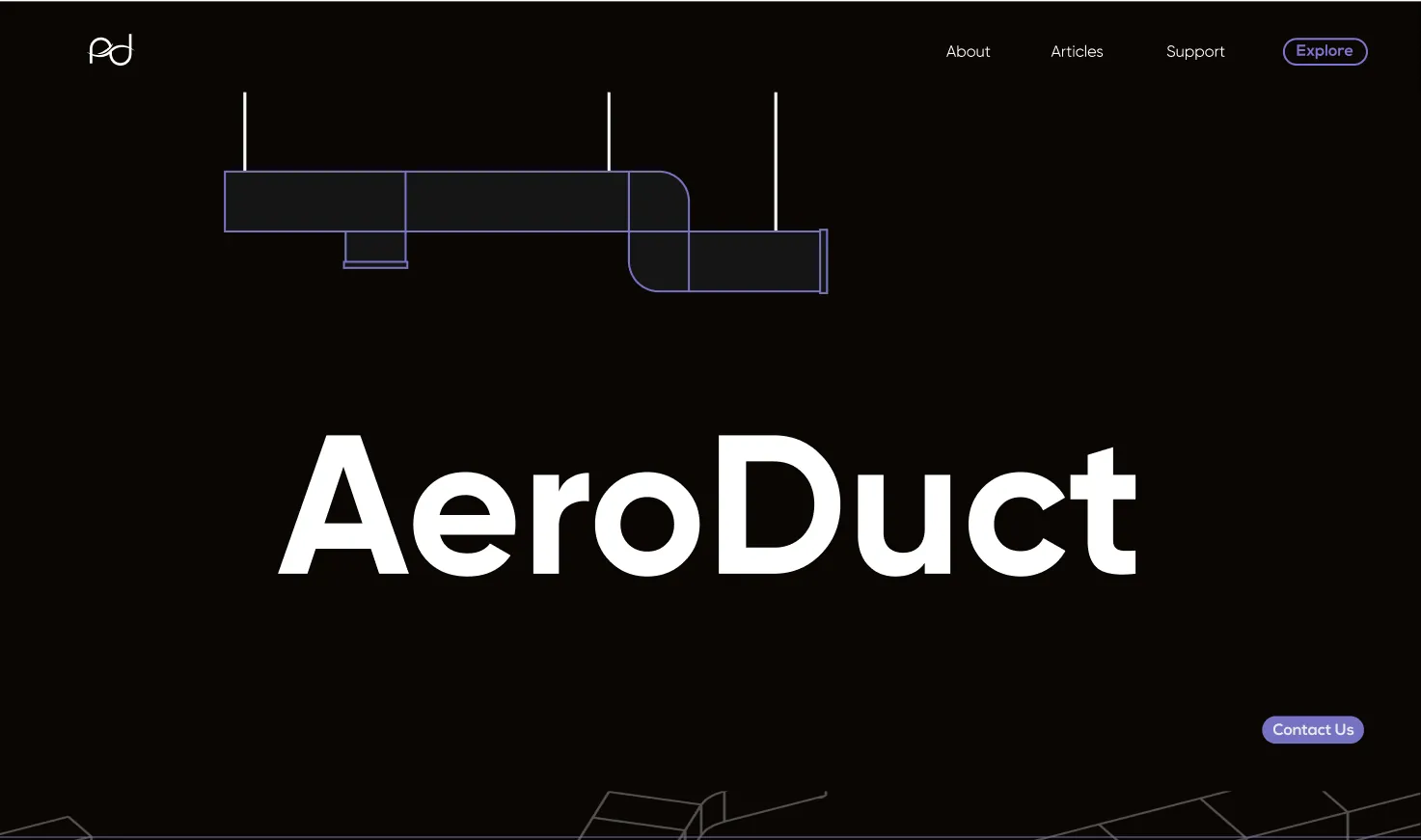
Final Branding and Deliverables
#446ED8 · Gilroy Medium
The identity shipped. The client adopted the mark, and it sits in the header of the company’s live website today.
See the brand live on aeroduct.in aeroduct.in