



01 · Brief
The Brief
I was asked to rebrand an existing yoga, physiotherapy and naturopathy centre. The client came with clear constraints:
- Use black, orange and gold, with each colour standing for something of its own
- Include a lotus, because the parent company has a lotus in its logo
- Include a spine, since spine health is what the centre is about
02 · Moodboards
Moodboards
I made two moodboards. The first gathered wellness and physiotherapy brands with calm, clean layouts. The second leaned into Indian references (lotus marks, warm golds and traditional textures) to bring in the roots of yoga and naturopathy.
From there I set the name in a range of serif and sans-serif faces and tried it on orange and charcoal, to find a wordmark that felt warm but still clinical enough for a health centre.
03 · Ideation
Ideation
I sketched lotus forms, meditating figures, a Devanagari wordmark and spine-and-petal hybrids. The direction that stuck was a lotus whose base curves like a spine, with dots for the vertebrae.
I narrowed this down to five concepts, varying the number of petals, the weight of the spine curve and how the dots trail off.
04 · Final mark
Final Mark
The final mark puts orange petals and a gold spine on black, so each of the three brand colours has a clear role. I delivered it as an app-style icon, a stacked lockup and a horizontal lockup for signage and the web.
Icon
Stacked
Horizontal
05 · In use
Implementation
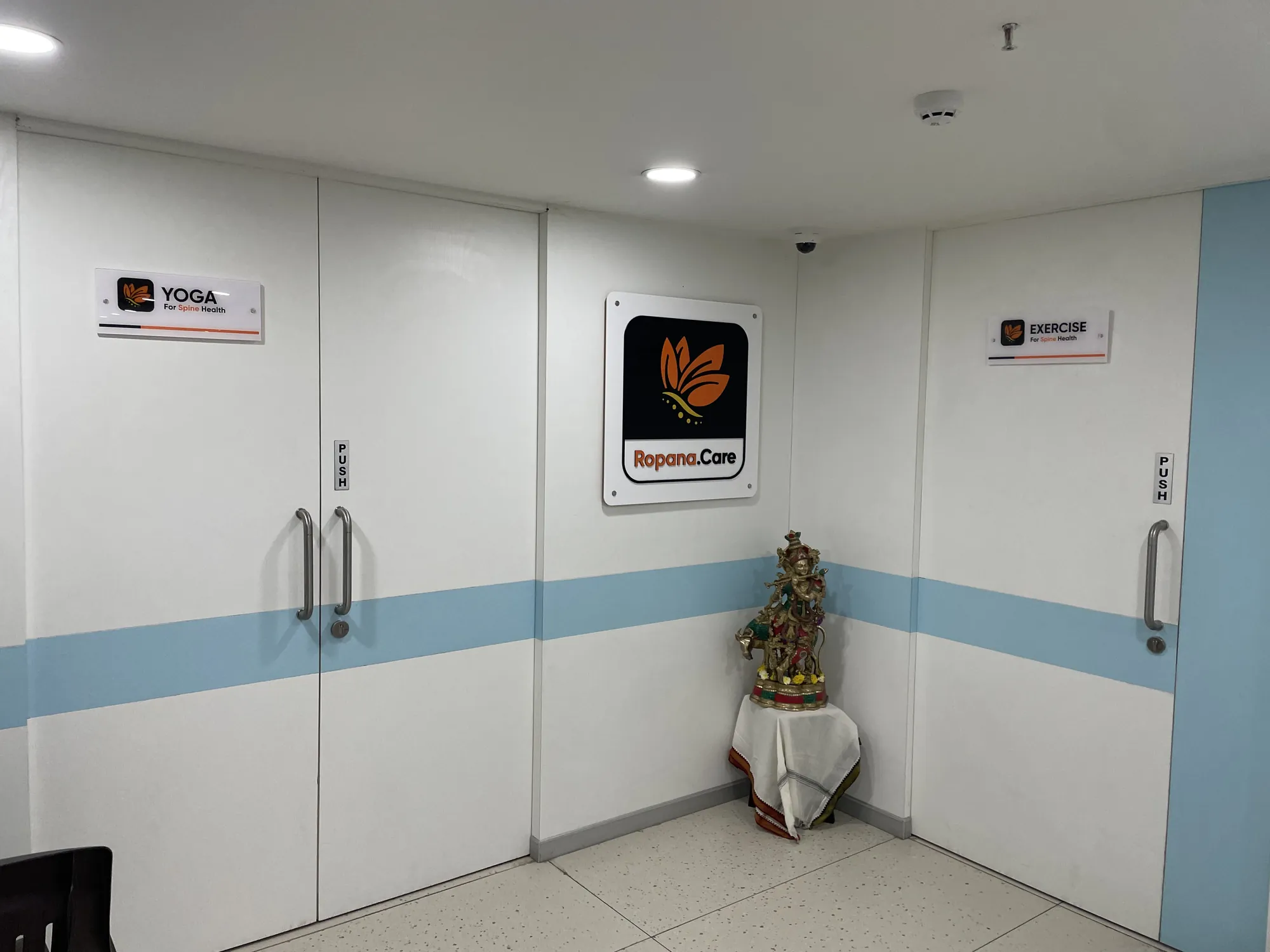
The identity went up at the centre: the Ropana.Care sign in the corridor, plus matching wayfinding plates for the Yoga and Exercise rooms.
06 · CSSH rebrand
From Ropana.Care to CSSH
Ropana.Care has since become the Center for Spine & Sports Health (CSSH), co-founded by badminton coach Pullela Gopichand and based at the Pullela Gopichand Badminton Academy in Gachibowli, Hyderabad. The new name moved the centre from wellness towards spine and sports science, so I redesigned the logo and gave it a new colour palette.
I kept the lotus-and-spine symbol, so the brand people already knew carried over, and rebuilt the lockup around the longer name. The palette swaps the warm black, orange and gold for green and blue: green for Spine and blue for Sports, matching the two halves of the name, with the leaves fading from lime to green. The same symbol also sits in the logo of the parent brand, nSure Healthy Spine.
The CSSH palette
- #42B754
- Green, for Spine
- #38A9E0
- Blue, for Sports
- #9ECB46
- Lime, where the leaf gradient starts
- Black
- Type and wordmark
CSSH today
- 7,350+
- Clients served, per CSSH
- 26
- People on its listed leadership and clinical team
- 4.8★
- Google rating, from 56 reviews
- 50+
- “Health enablers”, per CSSH
The new identity runs through the centre itself: on the glass partitions, and on the screens of the strength-assessment machines.
What I take from this: a mark built on the client’s real constraints (a parent brand’s lotus, a focus on spine health) was strong enough that, when the business changed its name and focus, the rebrand could keep it and change everything around it.